5 Ways to Ensure Website Accessibility as Per ADA – AccessiBe Specifications
Accessibility means everyone with physical and cognitive disabilities can access the website and understand the information given there. For any government websites, public mobile applications, or private websites for public usage, it is unnecessary to ensure accessibility to all. There are many tools available to ensure web accessibility, which you can make use of to ensure that your website is accessible to all compliant with the Americans with Disabilities Act 1990. In this article, we will discuss a few tips to ensure the accessibility of your business website.
Tips to ensure accessibility – AccessiBe
-
Choosing a CMS with an accessibility support
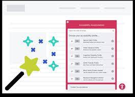
Most websites are now made using content management systems or CMS, the major CMS being used now, which puts forth the many accessibility tools. You can instantly make use of the accessibility features of these CMS and AccessiBe plug and play tools to ensure ADA compliance.
-
Properly structuring the content
People with disabilities usually use screen readers to understand a web page’s content and navigate effectively. By using the header tags like H1, H2, etc., properly, the content of a web page can be well organized and easily interpretable by the screen readers. For example, H1 is used as the primary title of a web page. Usage of H1 for any other content should be avoided; otherwise, the screen readers will misinterpret it. You also should not skip the heading levels of H1 to H3 as the screen readers may fail to interpret it well otherwise.
-
Usage of alt text
Accessibility also mandates proper usage of alt text for images and videos on the web pages. This is more important for any informative images or infographics on the page. The alt text should contain the exact message which you want to convey with the image. An exception to this is when you use images purely as decorative elements. But it is advisable to provide a proper description for these types of images too to make people with disabilities understand its purpose.
-
Making links unique with descriptive text
While you put links on the pages, try to use proper text to describe what the links are meant to. Simply using ‘click here or ‘know more’ is not acceptable, but you have to consider a more descriptive text. It should also clarify where the links are taking the users to. Content of the particular link needs to be presented so that the screen readers and link navigation to be done properly to avoid confusion.
-
Usage of colors
Color blindness is a condition that affects almost 8% of the US population. In order to ensure optimum accessibility, colors also needed to be used judiciously. If colors are used without considering the challenges of the color blinds, it will prevent these individuals from understanding the page content. Similarly, people with learning disabilities also may have problems with colors being used to distinguish between the important content. So, use colors and other visual indications like question marks or asterisks without creating any confusion for the users.
Along with these, AccessiBe suggests that you also consider designing the forms by ensuring accessibility and the use of tabular data to ensure that all the content of a web page can be accessed through the keyboard itself without the usage of a mouse.


